TEAM BRANDING
Our team brand is what we associate ourselves with. Visually, we use design concepts and colors with meaning to add depth and meaning to our brand. Similarly, we have associated our team's values with our name and slogan.
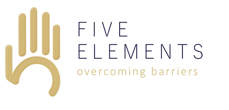
our name & slogan
Our team name was originally inspired by the Earth’s five natural elements. Together earth, space, air, fire, and water are the foundation of our world. As a similar concept, the five members of our team have different skillsets or “elements” that they bring to the team and together, form our foundation.
Our previous slogan for nationals was “braking barriers” where it has since been changed to “overcoming barriers” for states. Braking barriers was intended to be a play on words, representing the brakes on an actual formula 1 car. This message wasn’t well-received, however, as many people thought the word was misspelled. We, therefore, changed our slogan to “overcoming barriers”, believing this is more impactful.
As a team, we have overcome gender, culture, and academic barriers and believe this word better suits this and generates a more positive response as compared to breaking. Our slogan tells a similar story, reflecting how we have overcome barriers within ourselves to come together as a team. We have outlooked our differences stepped outside of our comfort zones and broken cultural, academic, and gender barriers as participants in this competition and strongly believe our brand, team name, and slogan showcases this and is a testament to change and unity.
our logo
Our logo for states is composed of three parts – our hand sub mark, team name, and slogan. We have consistently used our brand’s colors and typefaces in the design, creating a logo incorporating our two primary colors – navy blue and gold and primary typefaces – Calibri Light and Yu Gothic. The hand sub mark in our logo is our main point of recognition and to us symbolizes unity, collaboration, and strength, which are values we try to pride ourselves in as a team.
We believe this logo well represents our team and signifies teamwork, with each of the five fingers representing the five members of our team. A hand is not complete without five fingers, nor is Five Elements without all five of our team members. As one, we are the hand, but individually have different skillsets and elements and leave behind our own legacies, or “fingerprints”. For these reasons, we have continued to incorporate the hand into our logo, believing it best represents our team and tells our story as five unique people.
Additionally, when turned 90˚ clockwise, the hand sub mark of our logo takes shape of the characters “5E”. The palm and thumb of the hand look like the number five, and the four fingers resemble the letter “E” (figure 6). 5E is the abbreviation of our team name, and by incorporating this into our logo we believe we can add depth to it.